Keywords:
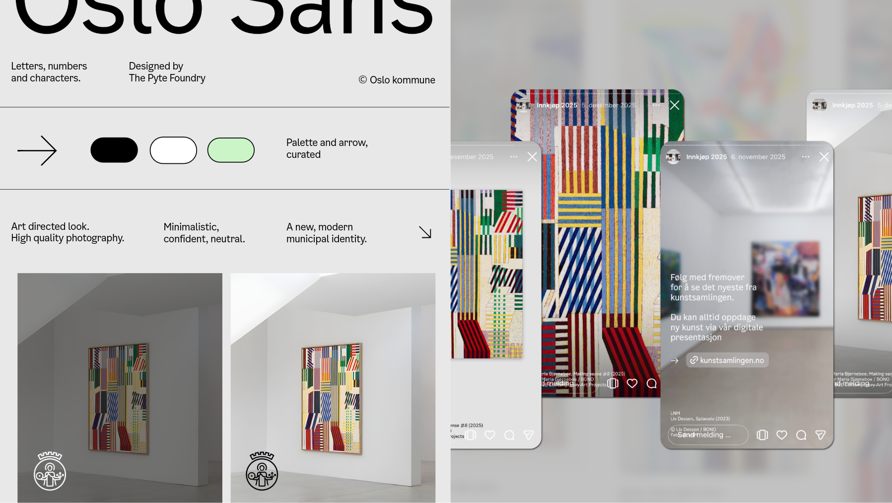
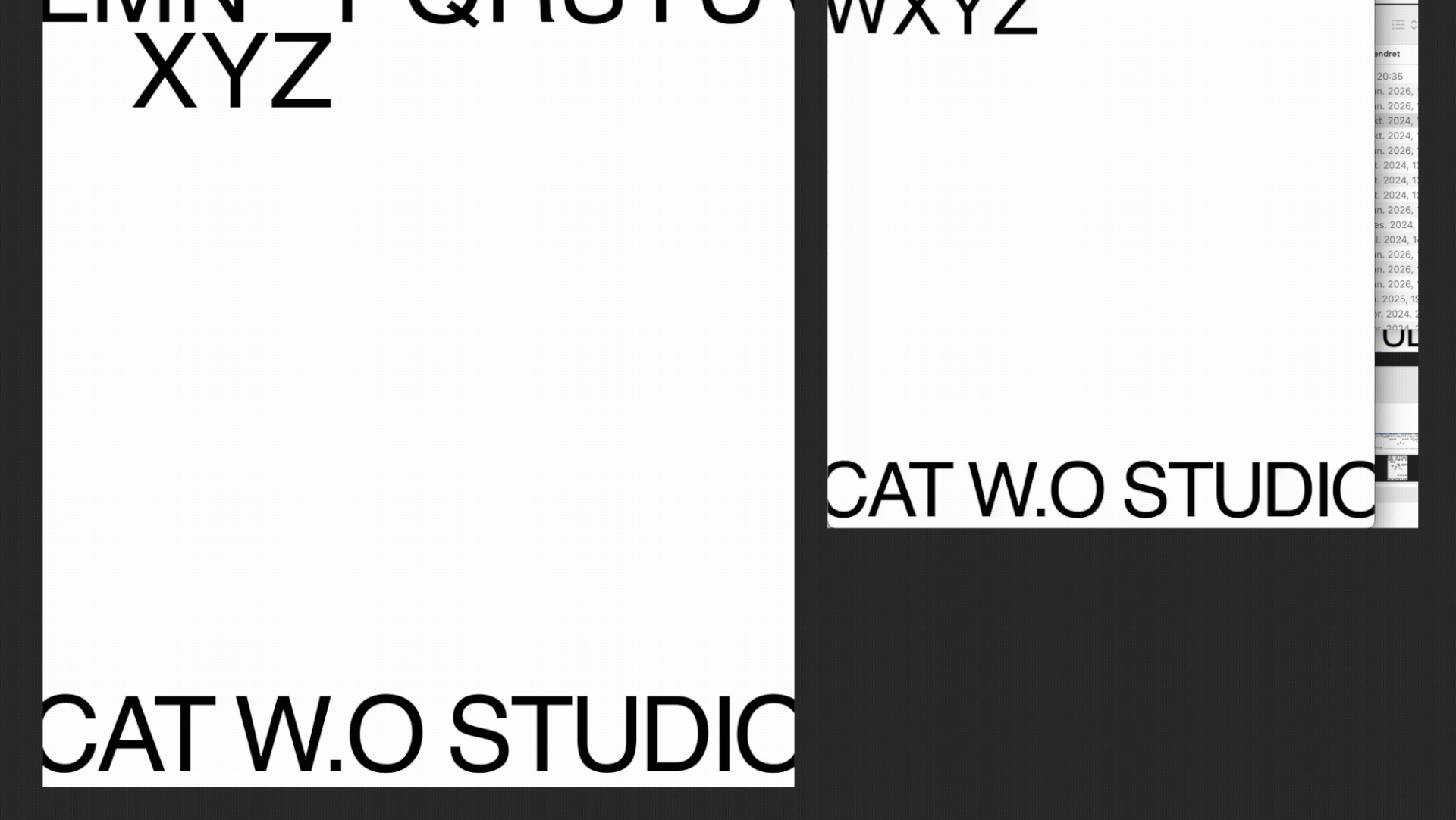
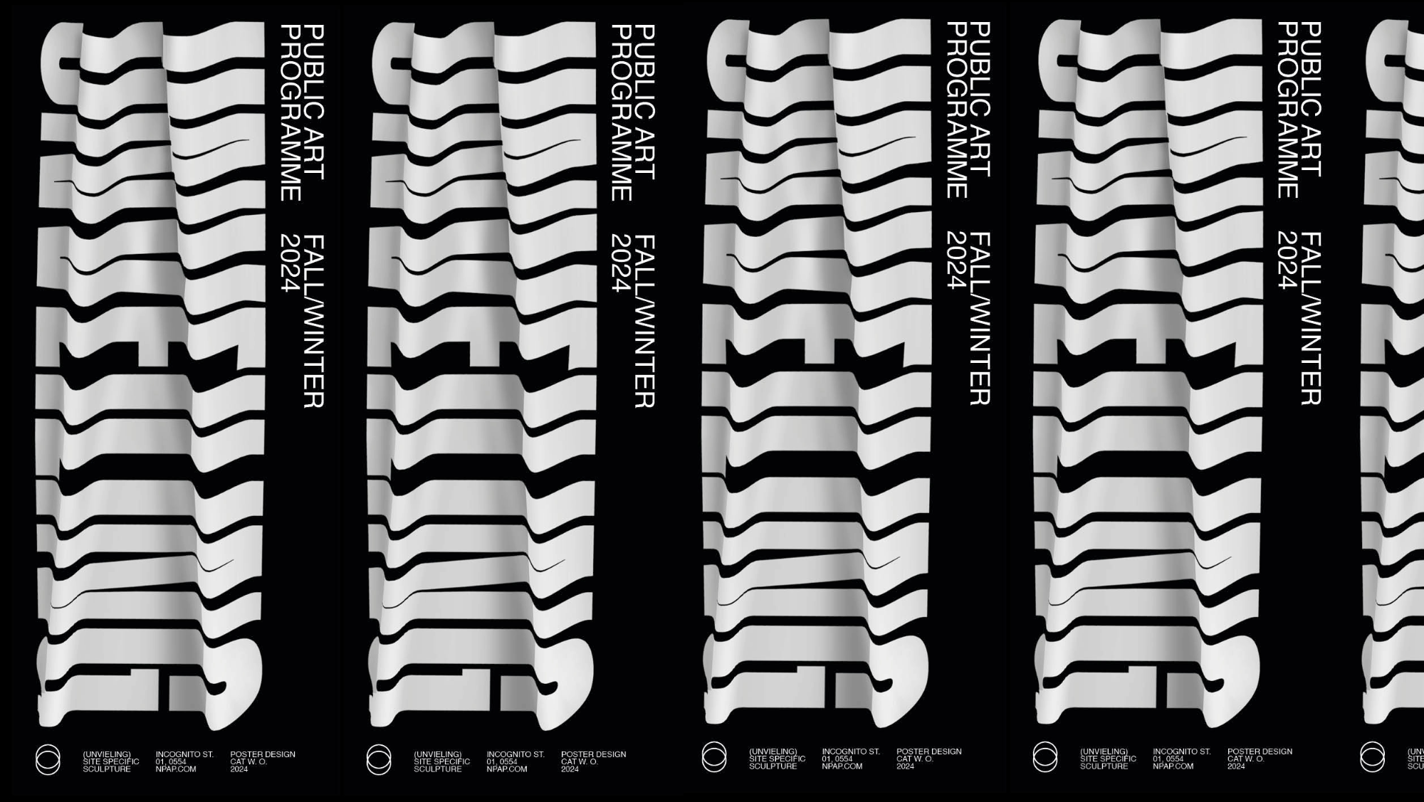
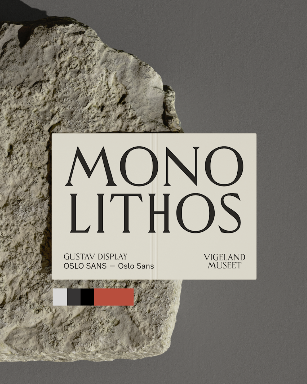
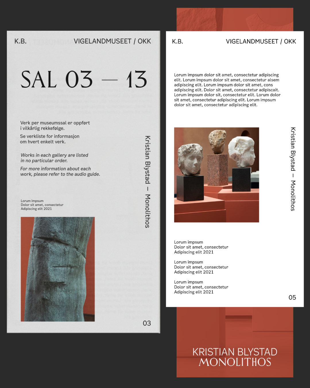
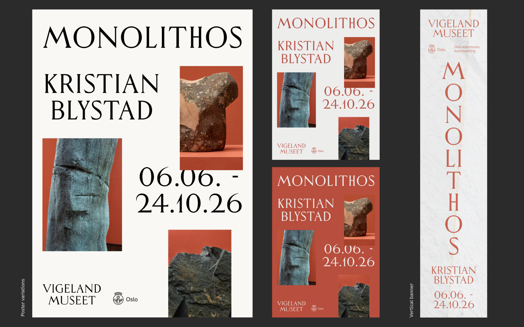
Refined system. Print and digital.
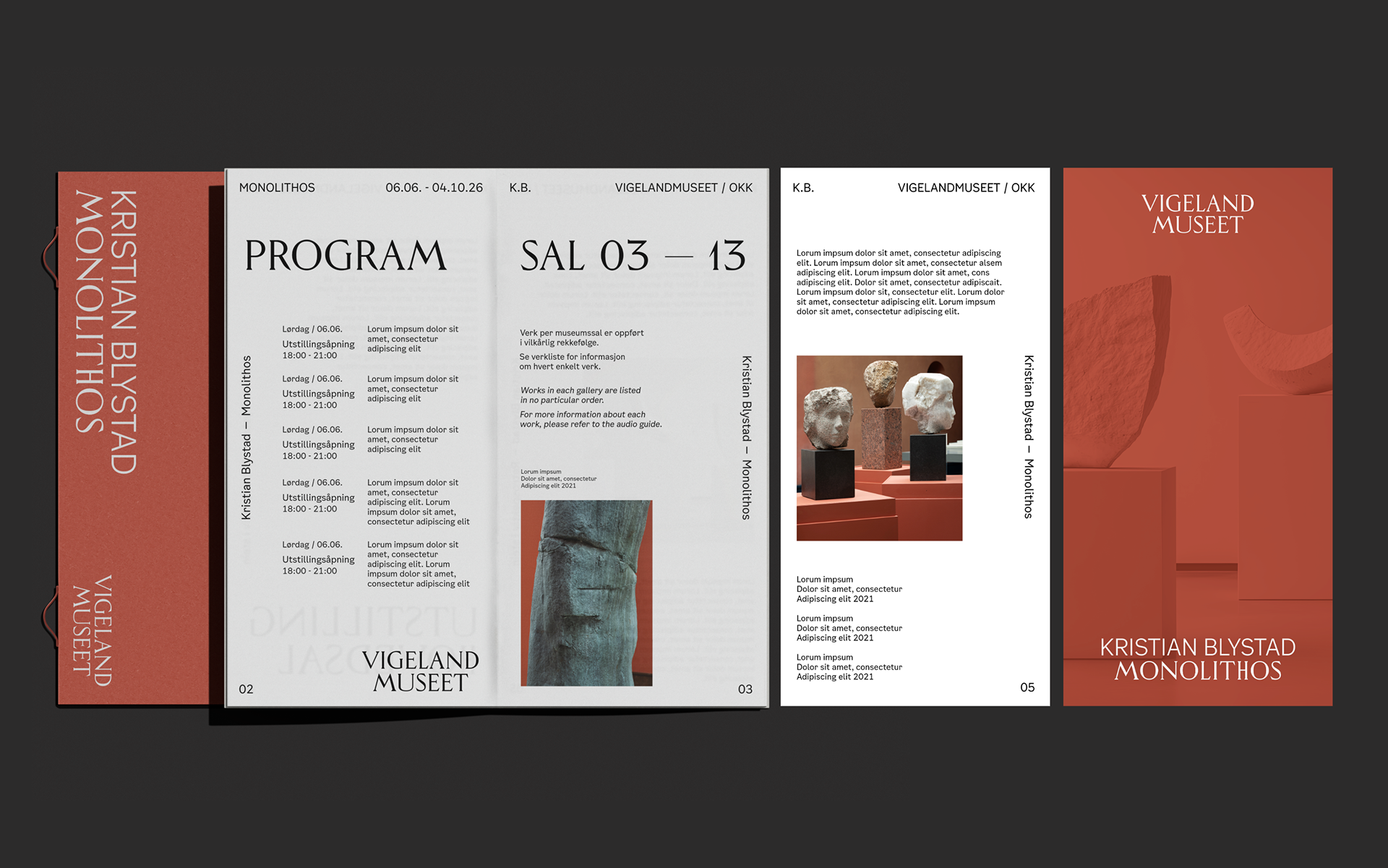
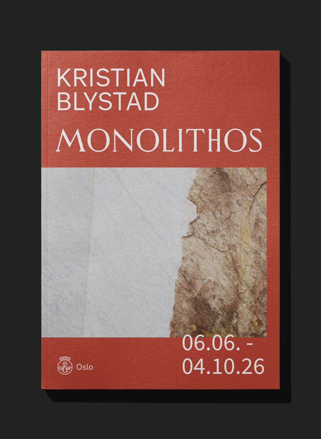
Heritage meets modernity.
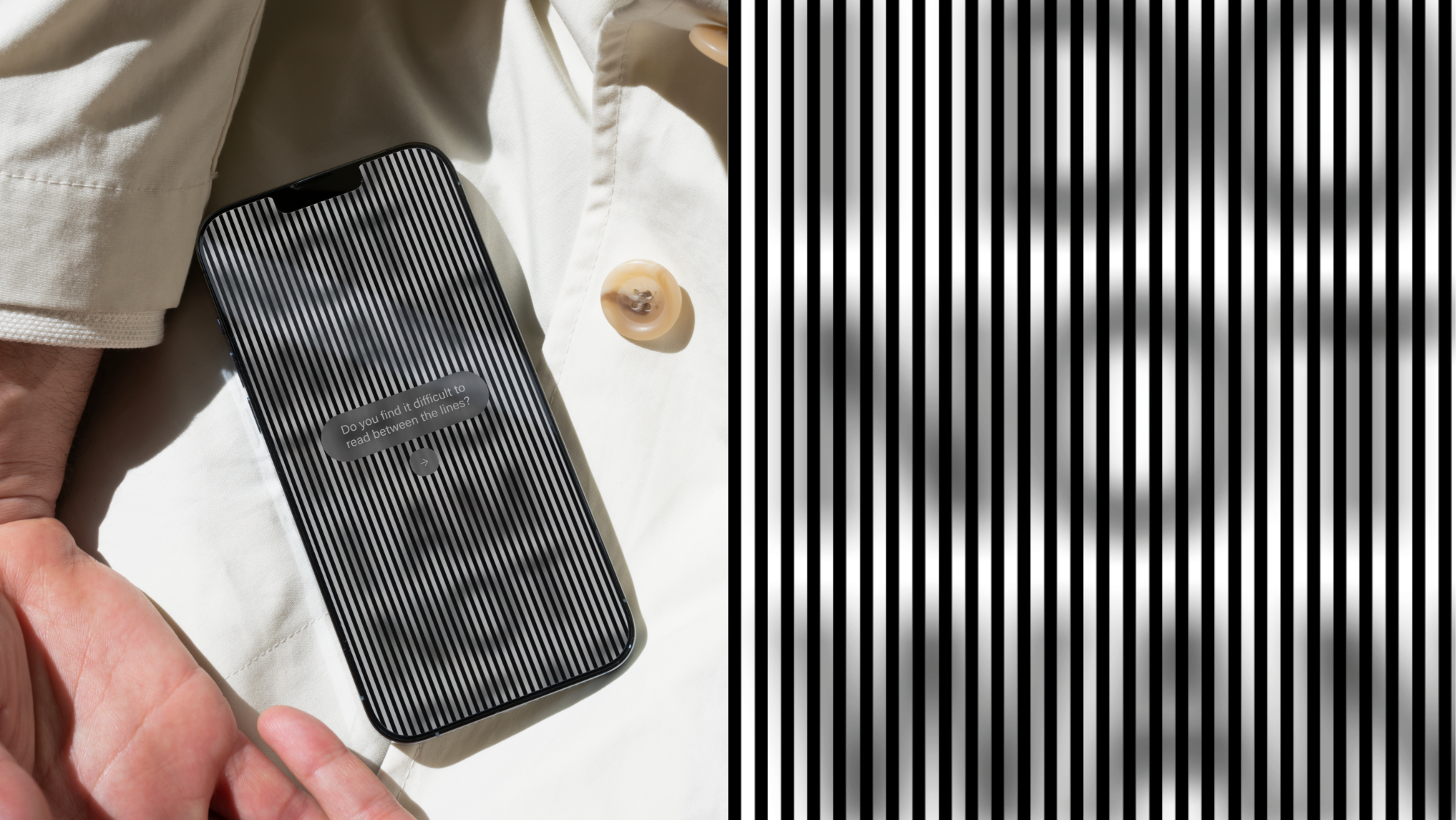
Contemporary elegance, yet accessible.
Refined system. Print and digital.
Heritage meets modernity.
Contemporary elegance, yet accessible.
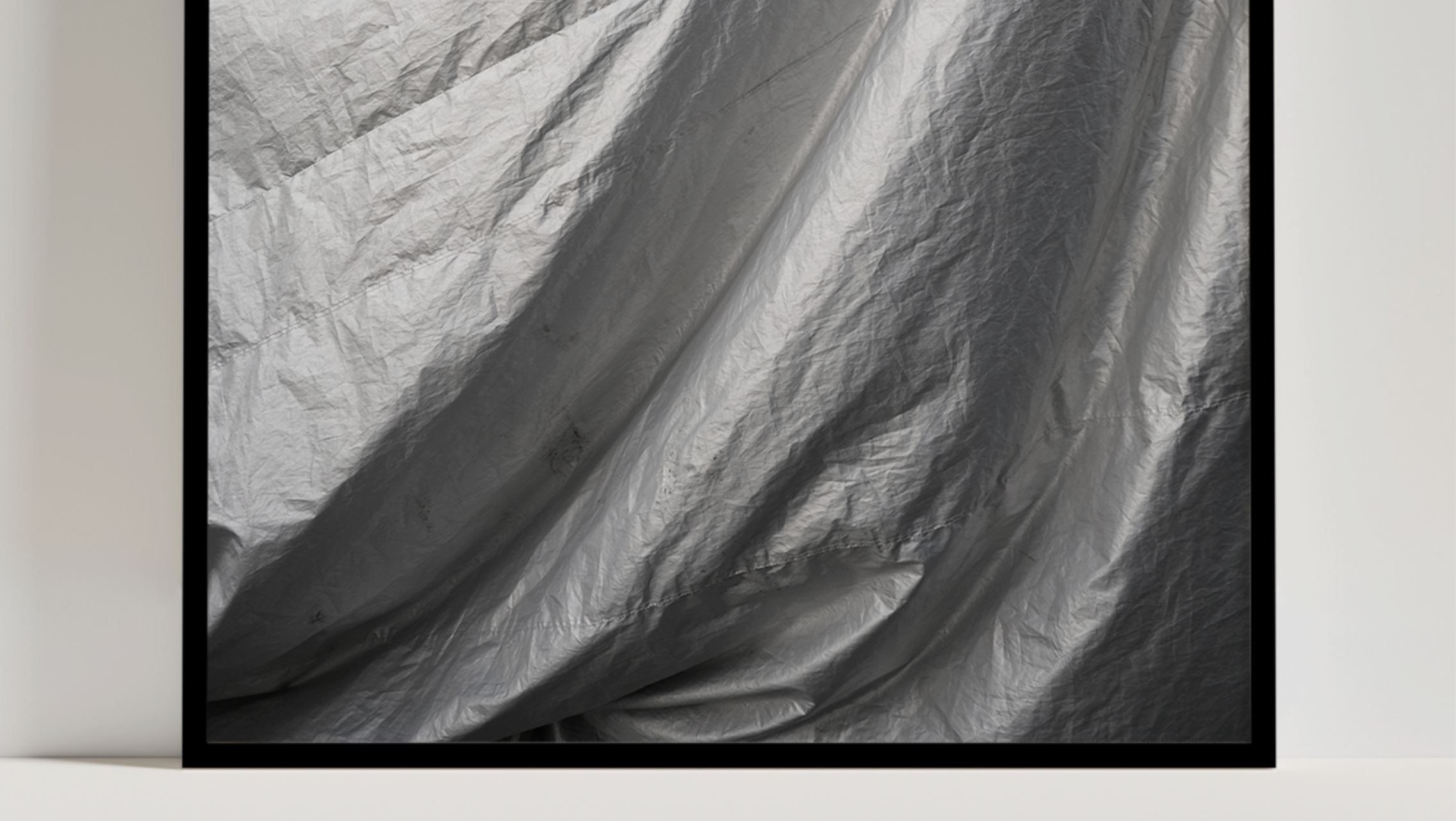
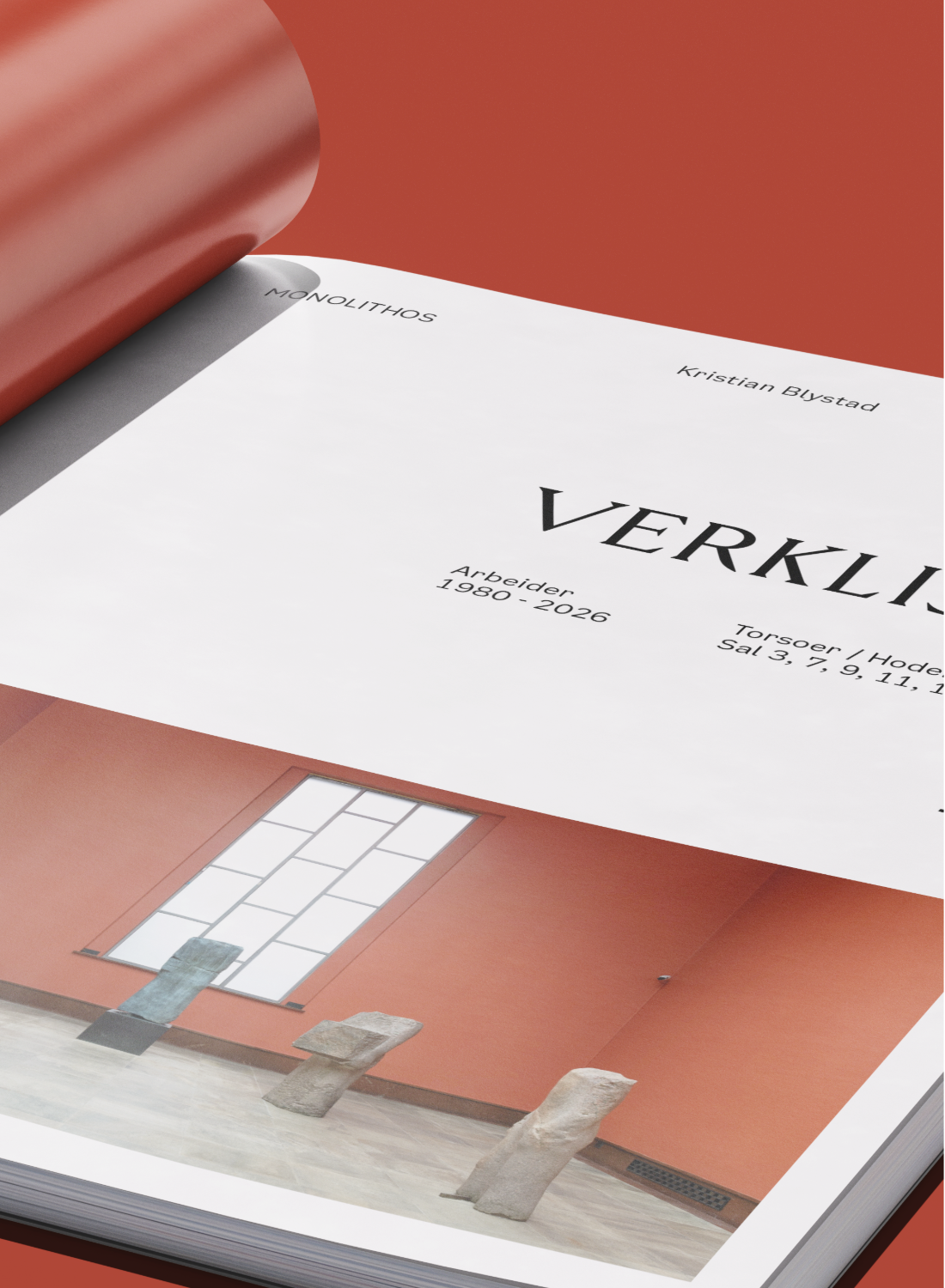
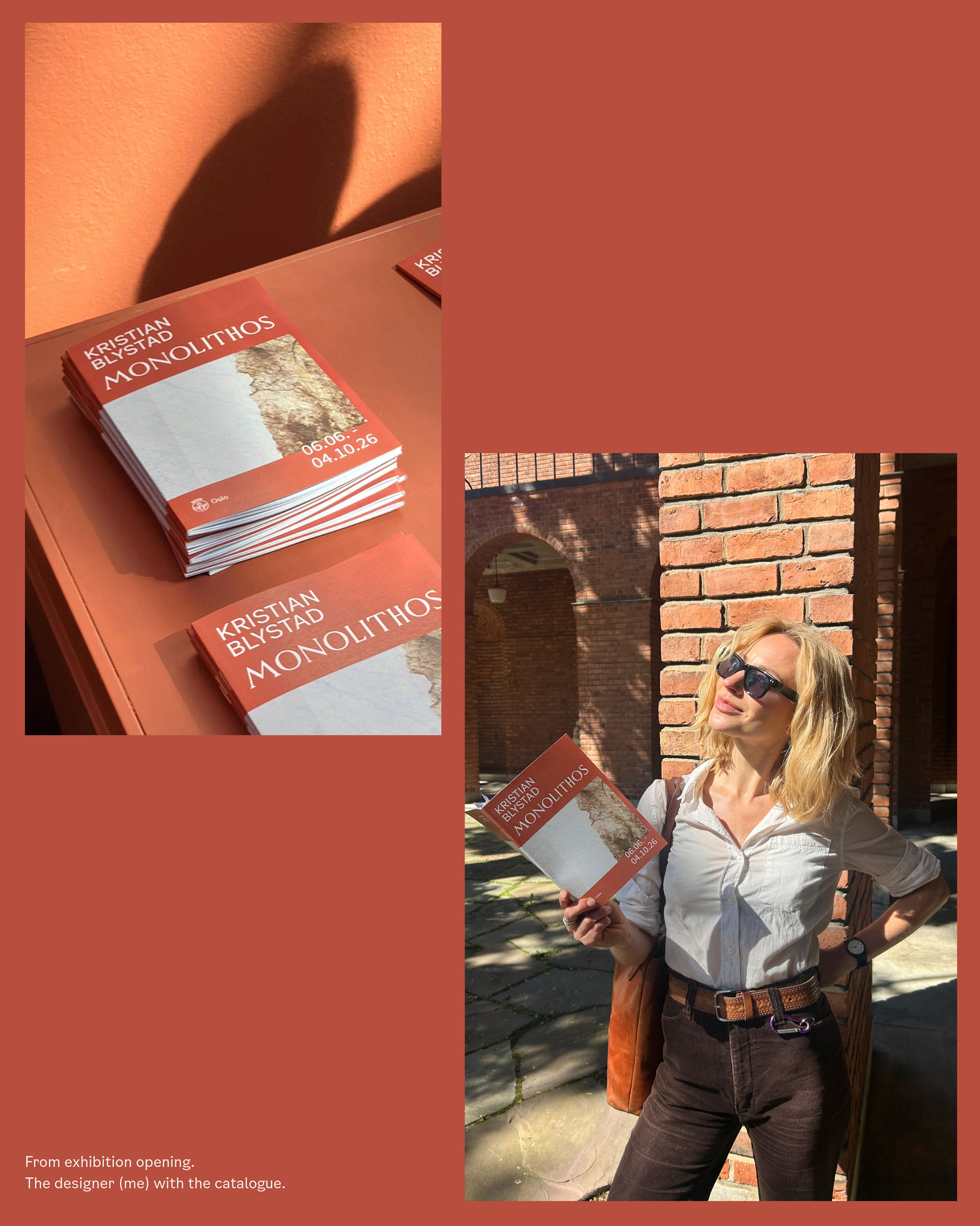
Photography by Istvan Virag
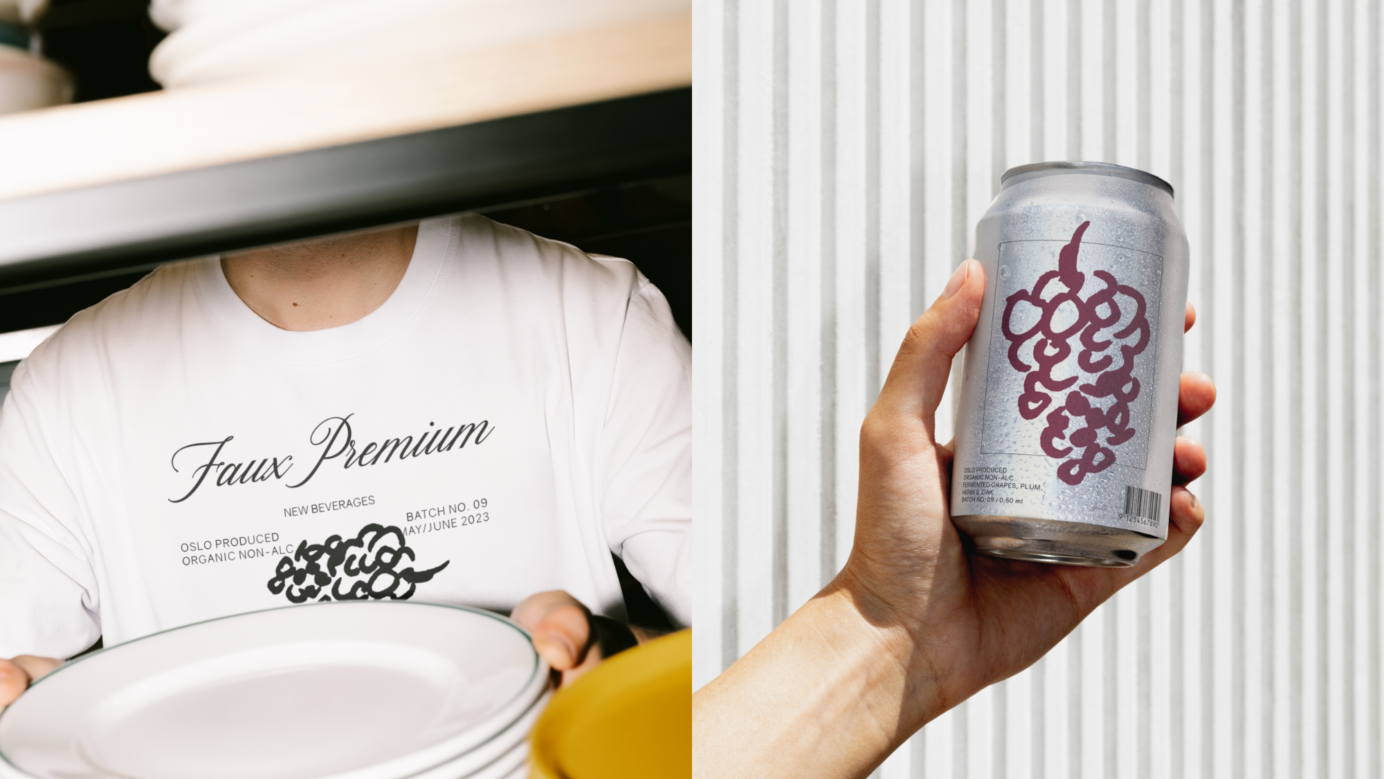
All artworks © Kristian Blystad.
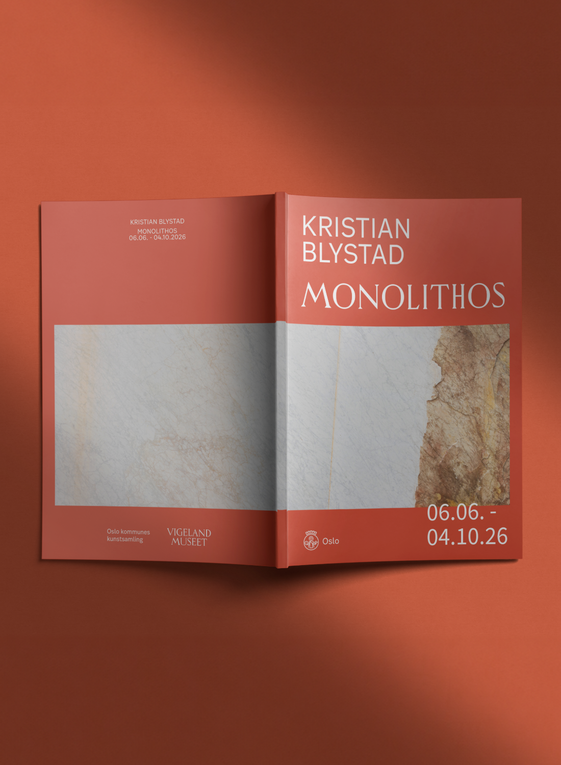
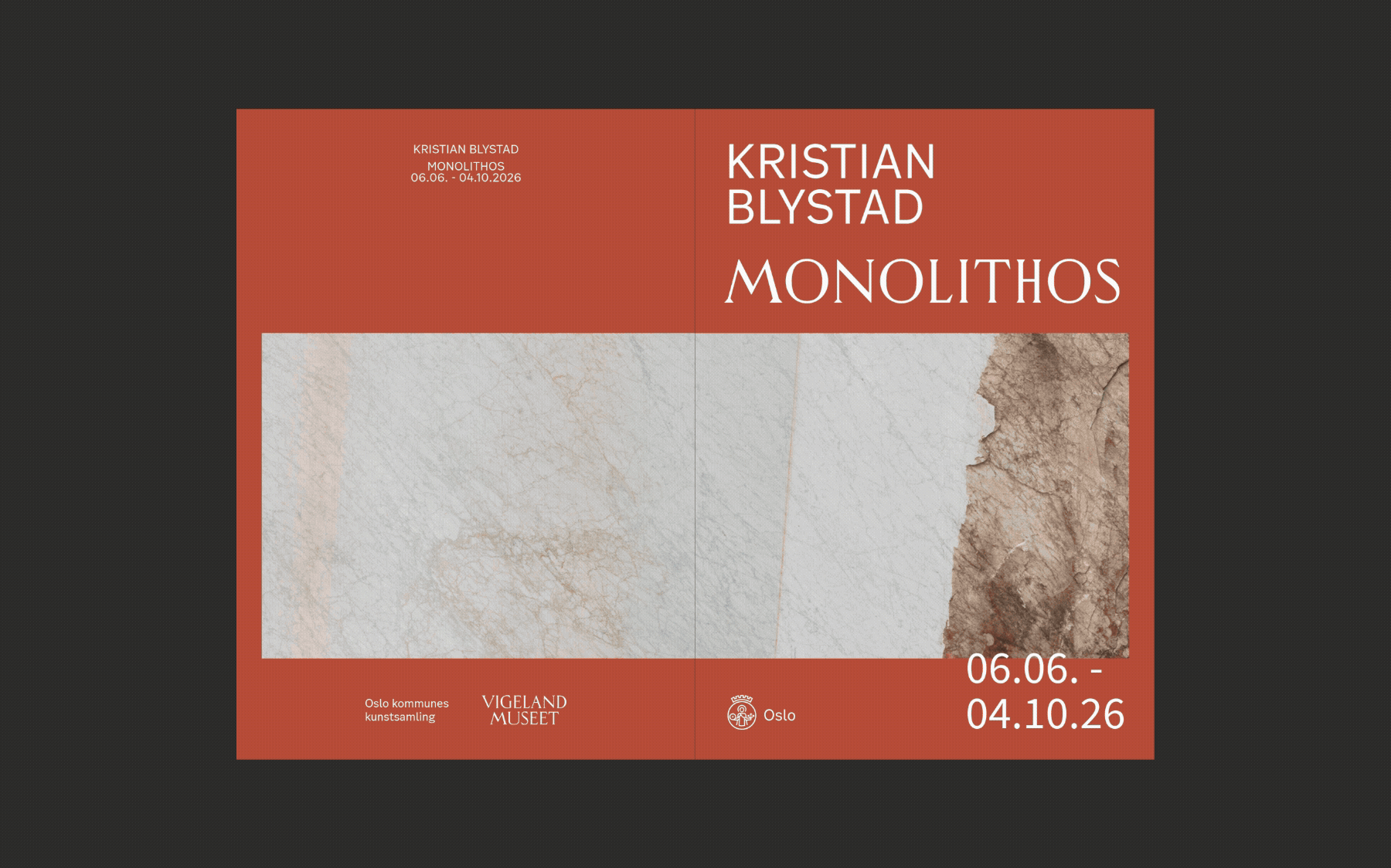
© Vigelandmuseet / Kristian Blystad
All artworks © Kristian Blystad.
© Vigelandmuseet / Kristian Blystad